Books and crosses
Published September 18, 2022
Apple released watchOS 9 and iOS 16 this past week which usually means a hideous evening of updating all the gadgets and running around looking at progress bars every which way. But it’s usually worth it for what the new release brings and this year, I’m determined to actually make the most of it and fully understand what upgrades have arrived, rather than just getting on with my day and being surprised when six months later I find a useful bit of functionality.
To that end, I’ve been working my way through the Macstories reviews which are INVALUABLE. If you have any interest at all, read them.
I might write a few posts about things I find but the one thing that has captured my attention, because I spend most of my spare moments with my head in the Books app, is changes to book formatting.
I try not to get too upset at design changes. Things evolve and you can’t turn them back so you have to get on with it - but that’s not to say there aren’t sometimes things that are annoying. As I say, I spend a good portion of those spare minutes reading - when I’m waiting for the kettle to boil, or before dropping off to sleep - so I’ve got used to the design of the Books app and made it work for me.
It used to be that the book took up the full page unless you tapped the screen to bring up menus. That meant a border top and bottom, plus info about how far you are through the book and the chapter. I tended to keep those menus up constantly because I liked the statistics, seeing how much of a chapter is left, and it helped have that ruler at the top to read against. That’s all gone now. The menu is a tiny button in the bottom right, and no straight lines with the notch in the way. It’ll take some getting used to but it’s not the end of the world.
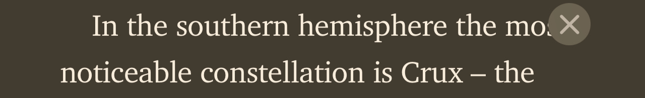
What I can’t forgive though, is this irritating floating cross that’s there to close the book. And get right in the way.
There are also ‘improvements’ to bookmarks, making them super easy to do - just a double tap. Too easy, really, because I have made about 20 bookmarks by accident. I don’t really bookmark much anyway, so it’s functionality I don’t need. But, now it’s super easy for me to have random things accidentally filed away to not look back on later.
But otherwise, there’s some good stuff added too. A lot more customisability in terms of theme - fonts, sizes, spacing, colors - everything that will make reading better for the individual. A lot of that is familiar from the Kindle app but it’s good to see it make its way over to Apple too. I’ll get used to the new style and adapt my reading to it, I’m sure, and the additions are worth a bit of retraining muscle memory.
So that’s one app complete, what’s next in the journey through iOS 16?